

lamp-img

Responsive Design

Seamless Web Experiences Across Every Device


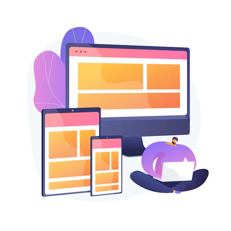
Our Responsive Design services create websites that automatically adapt to different screen sizes, devices, and user environments.

We focus on flexible layouts, intuitive navigation, mobile usability, and consistent visual experiences so your website performs effectively across desktops, tablets, and smartphones.
01. Mobile-Friendly Layouts


Designed for Modern Mobile Users

Our responsive websites adapt their layout and content to smaller screens, making it easier for users to browse, read, interact, and complete actions on mobile devices.


  • Mobile-Friendly Layouts
  • Flexible Content Sections
  • Responsive Navigation
  • Touch-Friendly Elements
  • Readable Typography
  • Mobile-Optimized Interfaces

02. Tablet & Desktop Compatibility


We ensure websites maintain a professional appearance and functional experience across tablets, laptops, desktops, and other common screen sizes.


  • Tablet Compatibility
  • Desktop Layouts
  • Flexible Grid Systems
  • Adaptive Images
  • Responsive Content

03. Flexible Page Structures


Responsive layouts use flexible structures that allow website content, images, navigation, and components to adapt naturally to different screen dimensions.


  • Flexible Containers
  • Responsive Columns
  • Adaptive Images
  • Flexible Typography
  • Dynamic Content Layouts

04. User-Friendly Navigation


Make Every Interaction Simple

We design responsive navigation systems that remain clear and easy to use regardless of the device being used to access the website.


  • Responsive Menus
  • Mobile Navigation
  • Clear Page Structure
  • Touch-Friendly Controls
  • Simple User Journeys

05. Performance Optimization


Responsive development also considers website performance. Efficient layouts, optimized assets, and clean development practices help provide a smoother experience for users.


  • Optimized Images
  • Efficient Page Structure
  • Fast-Loading Content
  • Performance Optimization
  • Mobile Performance

06. Cross-Browser Compatibility


We develop websites with compatibility across modern browsers in mind, helping ensure that users receive a consistent experience across different browsing environments.


  • Modern Browser Support
  • Cross-Browser Testing
  • Consistent Layouts
  • Responsive Components
  • User Experience Testing

07. Why Choose Intellect Software?


  • Mobile-First Thinking
  • Responsive & Flexible Layouts
  • Modern Web Development
  • User-Focused Design
  • Performance Optimization
  • Cross-Device Compatibility
  • Ongoing Website Support

Create a Responsive Web Experience


Give your customers a consistent and engaging experience on every device with responsive web solutions from Intellect Software Ltd.


Request a Demo →

Request a Quote →

Contact Our Team →

Contact Me

Contact Us

Email Address

Office Location

Building: 21, Road: 12, Block: A , Rampura, Dhaka 1219, Dhaka.